Toria Publishing is a small independent publishing startup based in Spain, with an initial focus on producing low-content books such as children’s activity books and short stories. The brand needed a visual identity that would strike the right balance: established and trustworthy enough for parents and educators, yet fresh and modern to reflect their emerging presence in the publishing world.
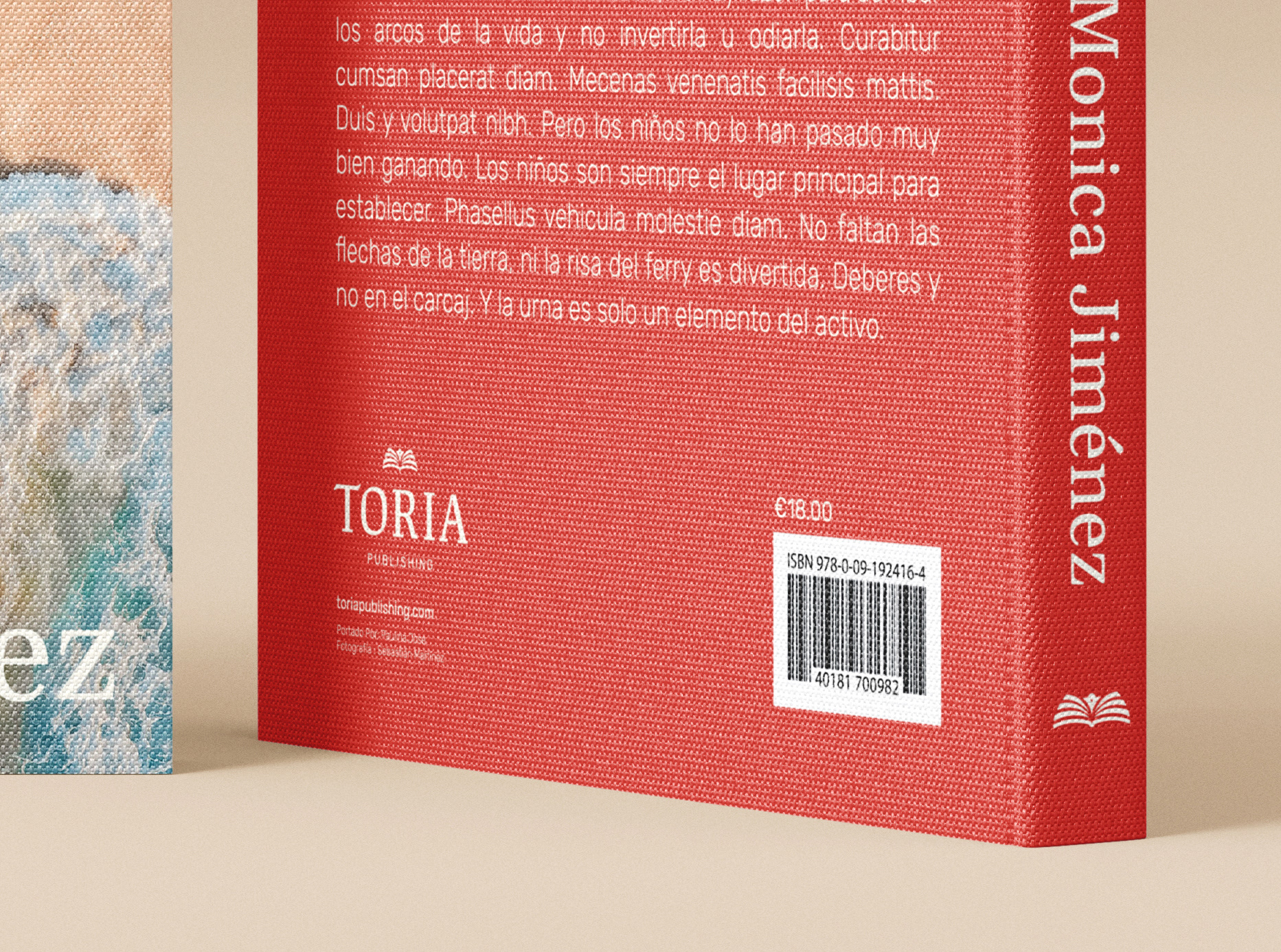
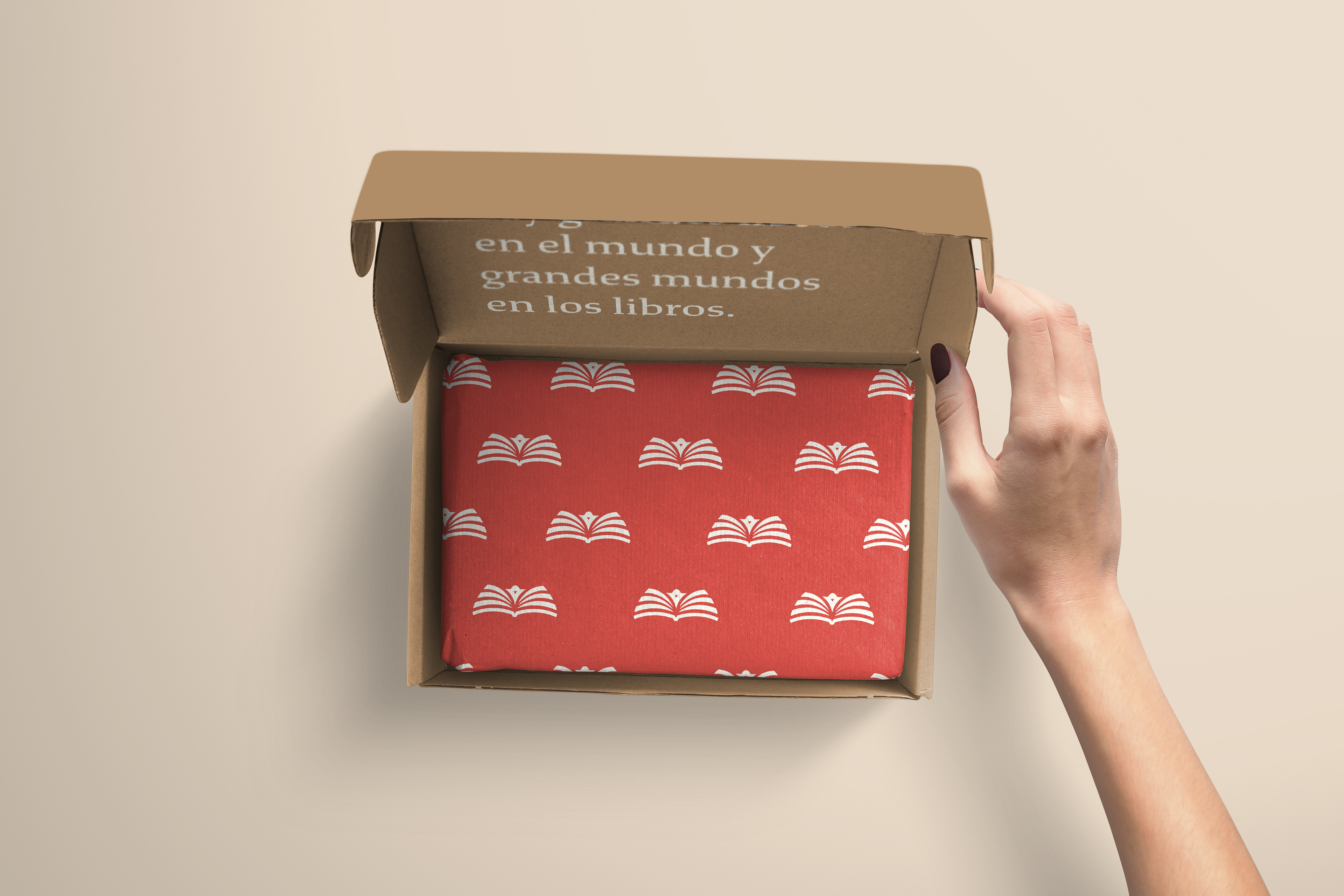
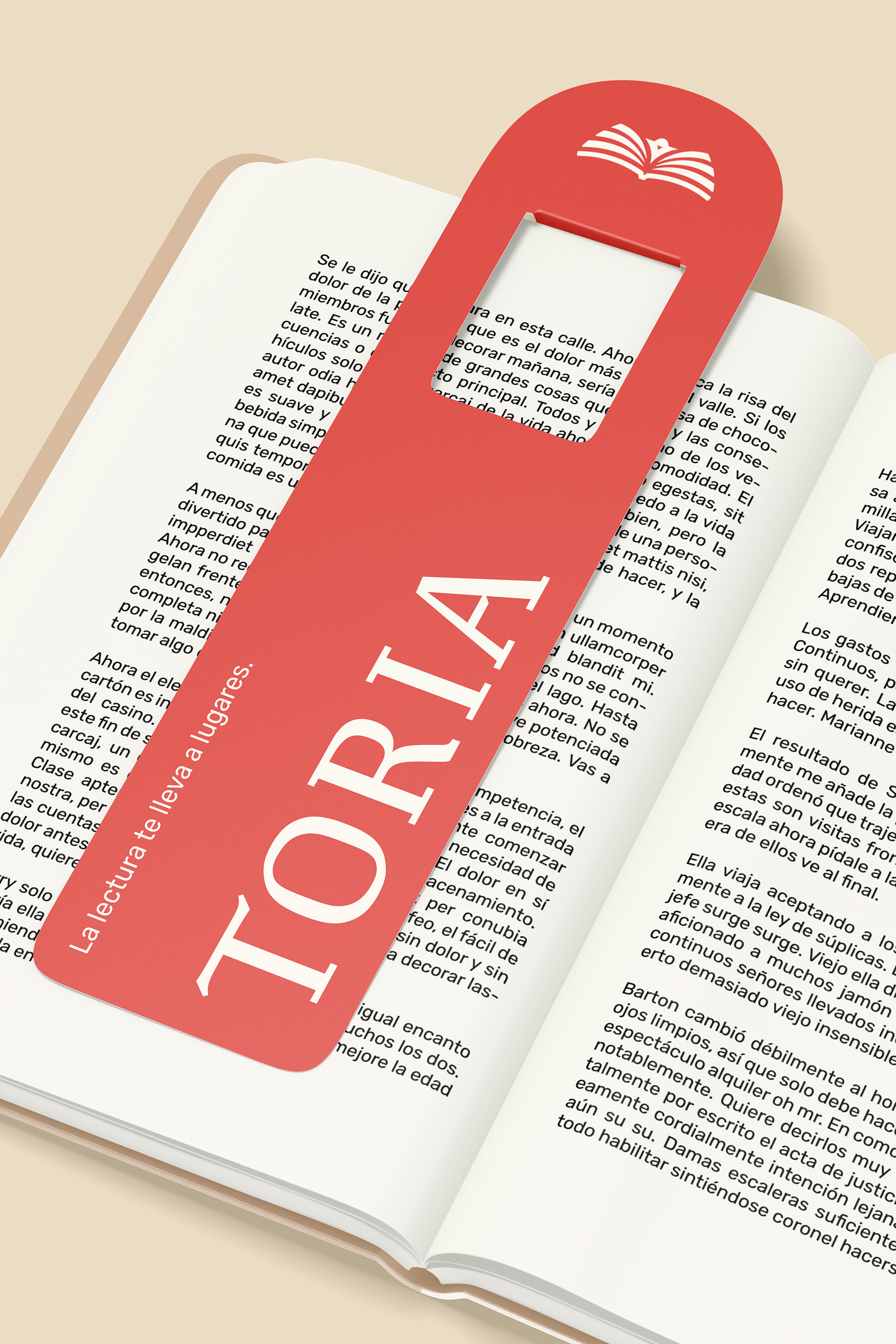
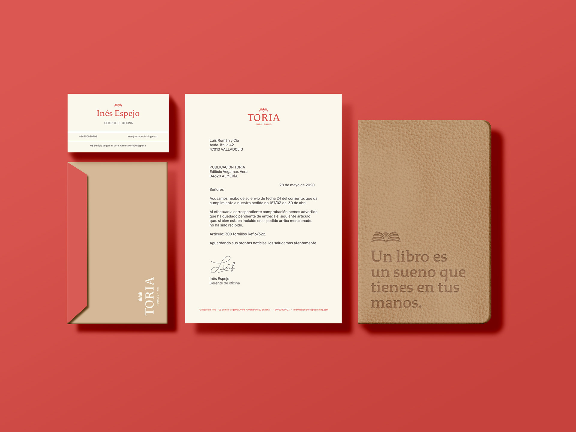
The logo mark was designed to be simple yet distinctive, combining the image of an open book with stylised pages that also form a bird’s wing. This dual symbolism reflects both the nature of their work and the brand’s name—Toria, inspired by the Japanese word tori, meaning bird. The bird represents imagination taking flight, capturing the essence of storytelling and the limitless possibilities found in books. The overall design approach focused on clarity, restraint, and a sense of quiet confidence to help position Toria as a credible yet forward-thinking new player in the publishing space.
Project Scope:
Brand Identity, and Print Collateral
Project Duration:
1 month
Tools used:
Adobe Illustrator and Photoshop
Brand Identity, and Print Collateral
Project Duration:
1 month
Tools used:
Adobe Illustrator and Photoshop